Essential Form Labeling
The most critical aspect of form accessibility is ensuring every input has a proper label. The presentation demonstrates several approaches:
Explicit Label Association
<label for="email">Email Address</label>
<input type="text" id="email" name="email">
This creates a programmatic relationship between the label and input. Screen readers announce the label when the input receives focus, and clicking the label focuses the input.
Alternative Labeling with ARIA
When visible labels aren't sufficient or available, use ARIA attributes:
<!-- When you need additional context -->
<input type="text"
       id="search"
       aria-label="Search products">

<!-- When referencing existing text -->
<h2 id="billing-header">Billing Information</h2>
<input type="text"
       id="card-number"
       aria-labelledby="billing-header card-label">
<span id="card-label">Card Number</span>
Providing Additional Context
Use aria-describedby to reference helpful text or instructions:
<label for="password">Password</label>
<input type="password"
       id="password"
       aria-describedby="pwd-help">

<div id="pwd-help">
  Password must be at least 8 characters long
</div>
For comprehensive guidance on implementing these techniques within a complete accessibility strategy, explore our detailed guide to WCAG compliance and inclusive design, which covers form accessibility alongside other critical compliance requirements.
Grouping Related Fields
The presentation emphasizes using fieldsets and legends to group related form controls, particularly for radio buttons:
<fieldset>
  <legend>Preferred Contact Method</legend>

  <input type="radio" id="contact-email" name="contact" value="email">
  <label for="contact-email">Email</label>

  <input type="radio" id="contact-phone" name="contact" value="phone">
  <label for="contact-phone">Phone</label>

  <input type="radio" id="contact-mail" name="contact" value="mail">
  <label for="contact-mail">Mail</label>
</fieldset>
Why fieldsets matter:
- Screen readers announce the legend along with each radio button
- Creates logical groupings for related information
- Helps users understand the relationship between form controls
Address Form Example
<fieldset>
  <legend>Shipping Address</legend>

  <label for="ship-street">Street Address</label>
  <input type="text" id="ship-street" name="shipping_street">

  <label for="ship-city">City</label>
  <input type="text" id="ship-city" name="shipping_city">

  <label for="ship-state">State</label>
  <select id="ship-state" name="shipping_state">
    <option value="">Select State</option>
    <option value="CA">California</option>
    <option value="NY">New York</option>
  </select>
</fieldset>
Semantic Input Types
The presentation mentions using appropriate input types for better accessibility and user experience:
<!-- Email input provides keyboard optimization on mobile -->
<label for="email">Email Address</label>
<input type="email" id="email" name="email">

<!-- Tel input optimizes mobile keyboard -->
<label for="phone">Phone Number</label>
<input type="tel" id="phone" name="phone">

<!-- Number input with constraints -->
<label for="quantity">Quantity</label>
<input type="number" id="quantity" name="quantity" min="1" max="10">
Error Handling and Feedback
The presentation discusses providing notifications and alerts for form feedback using ARIA live regions:
<form>
  <label for="username">Username</label>
  <input type="text" id="username" name="username" required>

  <label for="email">Email</label>
  <input type="email" id="email" name="email" required>

  <button type="submit">Submit</button>

  <!-- Error announcements -->
  <div role="alert" id="form-errors" hidden>
    <!-- Error messages appear here -->
  </div>
</form>
When validation fails, update the live region to announce errors:
function showFormErrors(errors) {
  const errorContainer = document.getElementById('form-errors');
  errorContainer.textContent = `Please fix ${errors.length} error(s) in the form`;
  errorContainer.hidden = false;
}
Required Fields
Mark required fields clearly for all users:
<label for="full-name">
  Full Name <span class="required">*</span>
</label>
<input type="text"
       id="full-name"
       name="full_name"
       required
       aria-required="true">
The presentation emphasizes using both visual indicators and programmatic markers (required attribute and aria-required).
Keyboard Navigation in Forms
Following the presentation's emphasis on keyboard accessibility, ensure your forms work completely without a mouse:
Tab Navigation:
- Users should be able to navigate through all form fields using Tab and Shift+Tab
- Tab order should be logical (typically top to bottom, left to right)
- All interactive elements must be keyboard accessible
Activation:
- Radio buttons and checkboxes: Space key to select
- Submit buttons: Enter or Space key
- Select dropdowns: Arrow keys to navigate options
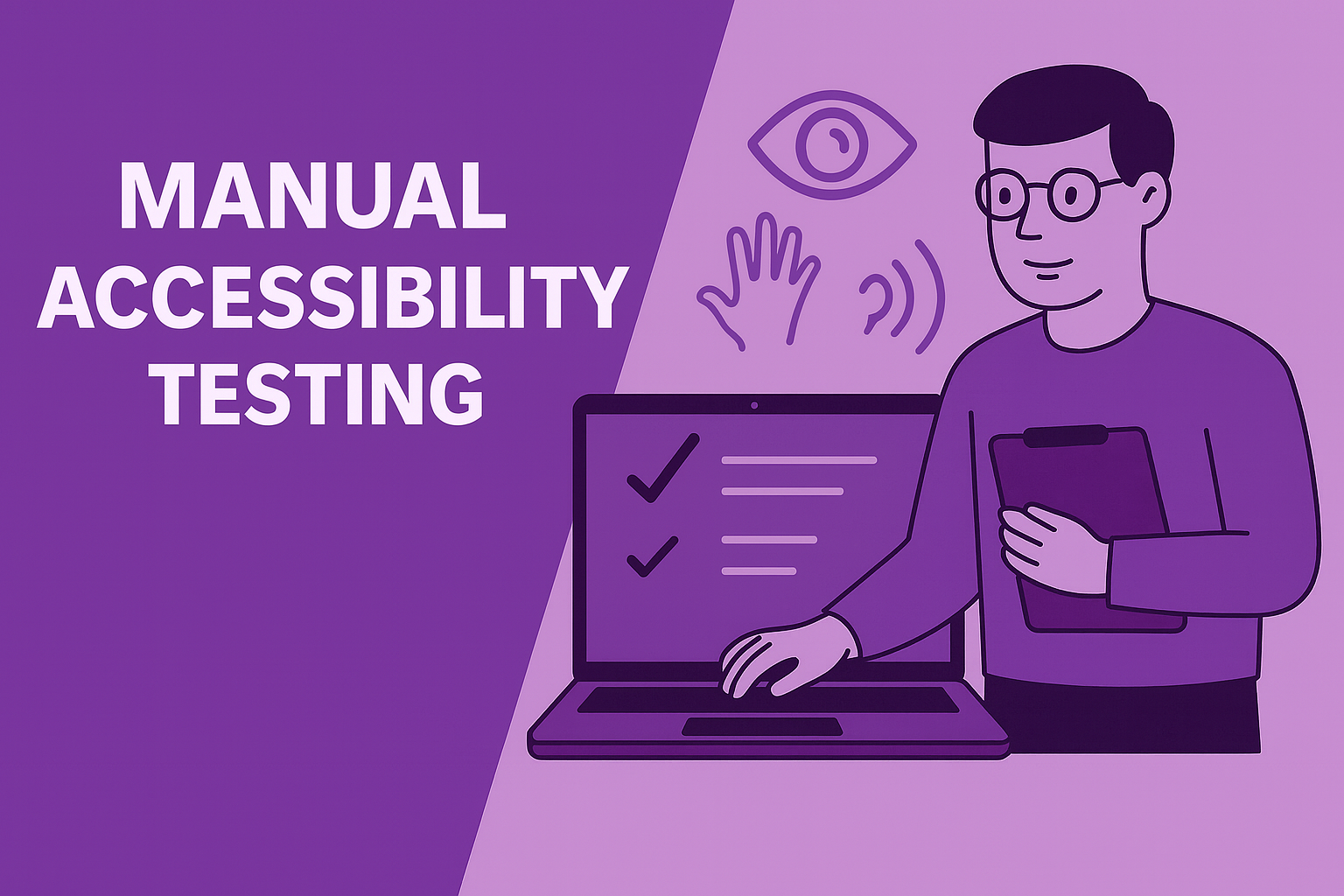
Testing Your Forms
The presentation mentions several testing approaches:
Manual Testing
- Navigate the entire form using only the keyboard
- Ensure all labels are announced by screen readers
- Verify that error messages are clearly communicated
- Test with different assistive technologies
Screen Reader Testing
The presentation specifically mentions NVDA as a screen reader for testing. Key things to verify:
- Labels are announced when focusing inputs
- Fieldset legends provide context for grouped fields
- Error messages are announced appropriately
- Required fields are identified
Automated Testing
Use tools mentioned in the presentation:
- Lighthouse accessibility audits
- axe-core for programmatic testing
- Wave Web Accessibility Evaluator
Common Form Accessibility Issues
Based on the presentation's examples of what not to do:
Missing Labels:
<!-- Wrong -->
<input type="text" placeholder="Enter your name">

<!-- Right -->
<label for="name">Name</label>
<input type="text" id="name" placeholder="Enter your name">
Improper Grouping:
<!-- Wrong -->
<p>Choose your preferred contact method:</p>
<input type="radio" id="r1" name="contact" value="email">Email
<input type="radio" id="r2" name="contact" value="phone">Phone

<!-- Right -->
<fieldset>
  <legend>Choose your preferred contact method:</legend>
  <input type="radio" id="contact-email" name="contact" value="email">
  <label for="contact-email">Email</label>
  <input type="radio" id="contact-phone" name="contact" value="phone">
  <label for="contact-phone">Phone</label>
</fieldset>
Implementation Checklist
Based on the presentation's accessibility guidelines:
Labels and Descriptions:
- Every input has a proper label
- Labels are associated using
forandidattributes - Additional context provided with
aria-describedbywhen needed - Required fields are marked both visually and programmatically
Structure:
- Related fields grouped with fieldset and legend
- Logical tab order throughout the form
- Semantic input types used appropriately
Feedback:
- Error messages announced to screen readers
- Success confirmations provided
- Users can identify and correct errors easily
Testing:
- Complete form workflow testable with keyboard only
- Screen reader announces all necessary information
- Form validates properly and provides clear feedback
The presentation emphasizes that web accessibility is "essential for some, but useful for all." This is particularly true for forms—clear labels, logical structure, and helpful error messages improve the experience for everyone, not just users with disabilities.
Ready to create forms that work for everyone? At Cleverix, we understand that accessible forms are critical for user engagement and business success. Our development team specializes in implementing the WCAG guidelines demonstrated in this article, ensuring your forms provide clear navigation, proper labeling, and effective error handling for all users. From simple contact forms to complex multi-step processes, we build forms that are both accessible and conversion-focused. Explore our development services and discover how proper form accessibility can improve user experience while ensuring full compliance with accessibility standards.


