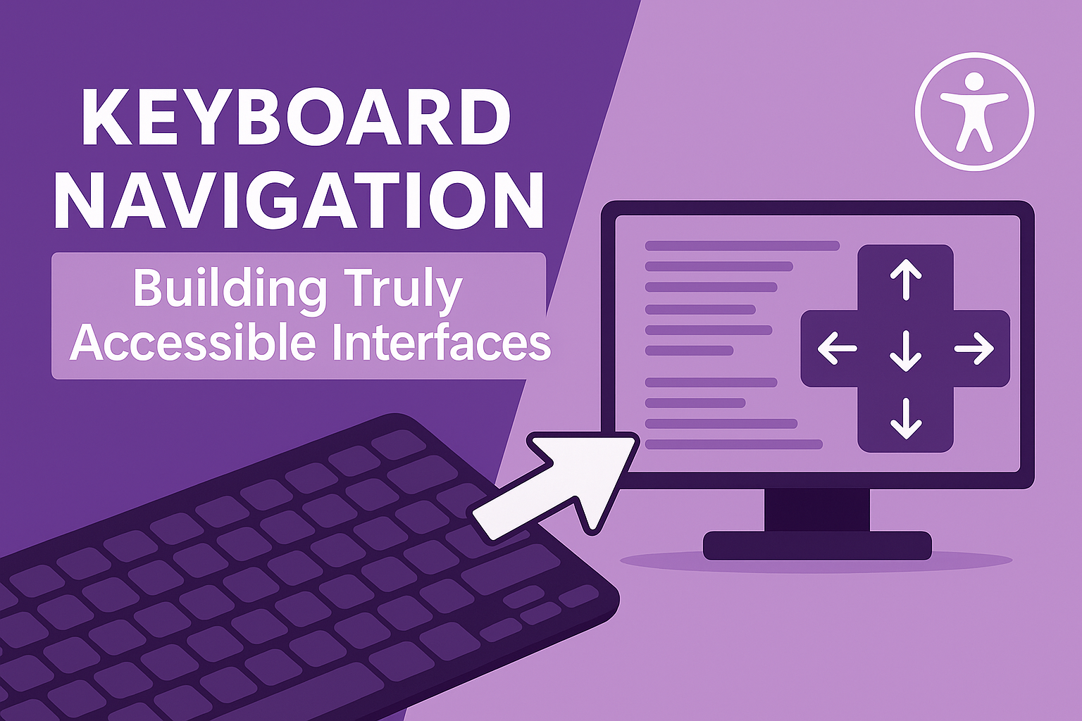
Why Keyboard Navigation Matters More Than Ever
Keyboard navigation isn't just about compliance - it's about creating interfaces that work for power users, people with disabilities, and anyone who needs efficient navigation. From developers using keyboard shortcuts to users with tremors who can't operate a mouse precisely, keyboard support dramatically expands your audience reach.
Recent accessibility lawsuits have increasingly focused on keyboard navigation failures. When major retailers like Target and Amazon faced legal action, keyboard accessibility violations were among the primary issues cited. The cost of retrofitting keyboard support far exceeds building it correctly from the start.
The Foundation: Focus Management
Visible Focus Indicators
The most common keyboard accessibility failure? Invisible focus indicators. When users press Tab to navigate, they need to see where they are:
/* Don't remove focus indicators */
button:focus {
  outline: none; /* ❌ Never do this */
}

/* Provide clear, visible focus indicators */
button:focus {
  outline: 2px solid #0066cc;
  outline-offset: 2px;
  box-shadow: 0 0 0 2px rgba(0, 102, 204, 0.3);
}

/* Modern approach with :focus-visible */
button:focus-visible {
  outline: 2px solid #0066cc;
  outline-offset: 2px;
}
Focus indicator best practices:
- Minimum 2px thick outline
- High contrast against background
- Consistent across all interactive elements
- Visible on all color themes/modes
Logical Tab Order
Tab order should follow visual layout: left-to-right, top-to-bottom in most Western interfaces:
Managing tab order:
- Use
tabindex="0"to add elements to tab order - Use
tabindex="-1"to remove from tab order (but keep programmatically focusable) - Never use positive tabindex values (1, 2, 3, etc.) - they break natural order
Focus Trapping
When opening modals or dropdowns, focus should stay within the component until dismissed. Here's a simple focus trap implementation:
function trapFocus(element) {
  const focusableElements = element.querySelectorAll(
    'button, [href], input, select, textarea, [tabindex]:not([tabindex="-1"])'
  );

  const firstElement = focusableElements[0];
  const lastElement = focusableElements[focusableElements.length - 1];

  element.addEventListener('keydown', (e) => {
    if (e.key === 'Tab') {
      if (e.shiftKey) {
        // Shift + Tab
        if (document.activeElement === firstElement) {
          lastElement.focus();
          e.preventDefault();
        }
      } else {
        // Tab
        if (document.activeElement === lastElement) {
          firstElement.focus();
          e.preventDefault();
        }
      }
    }

    // Close on Escape
    if (e.key === 'Escape') {
      closeModal();
    }
  });
}
Essential Keyboard Patterns
Skip Links: The Express Lane
Skip links allow keyboard users to bypass repetitive navigation and jump directly to main content:
<body>
  <a href="#main" class="skip-link">Skip to main content</a>

  <header>
    <nav>
      <!-- Navigation items -->
    </nav>
  </header>

  <main id="main">
    <!-- Primary content -->
  </main>
</body>
.skip-link {
position: absolute;
top: -40px;
left: 6px;
background: #000;
color: #fff;
padding: 8px;
text-decoration: none;
border-radius: 0 0 4px 4px;
z-index: 1000;
}
.skip-link:focus {
top: 0;
}Skip links should be the first focusable element on every page and become visible when focused.
Button vs Link: Keyboard Behavior
Understanding when to use buttons vs links affects keyboard interaction:
<!-- Links navigate (Enter key activates) -->
<a href="/products">View Products</a>

<!-- Buttons perform actions (Enter and Space activate) -->
<button onclick="addToCart()">Add to Cart</button>

<!-- Don't do this -->
<div onclick="doSomething()">Clickable div</div>
Button keyboard requirements:
- Activate with Enter and Space keys
- Support focus (automatic with
<button>) - Provide clear focus indicators
-
For comprehensive guidance on implementing these patterns alongside other accessibility fundamentals, explore our complete guide to WCAG compliance and inclusive design, which covers the full spectrum of accessibility requirements.
Custom Components: Dropdown Menus
Custom dropdowns require careful keyboard handling:
class AccessibleDropdown {
  constructor(trigger, menu) {
    this.trigger = trigger;
    this.menu = menu;
    this.isOpen = false;

    this.bindEvents();
  }

  bindEvents() {
    // Trigger events
    this.trigger.addEventListener('click', () => this.toggle());
    this.trigger.addEventListener('keydown', (e) => {
      if (e.key === 'Enter' || e.key === ' ' || e.key === 'ArrowDown') {
        e.preventDefault();
        this.open();
        this.focusFirstItem();
      }
    });

    // Menu item navigation
    this.menu.addEventListener('keydown', (e) => {
      const items = [...this.menu.querySelectorAll('[role="menuitem"]')];
      const currentIndex = items.indexOf(document.activeElement);

      switch(e.key) {
        case 'ArrowDown':
          e.preventDefault();
          const nextIndex = (currentIndex + 1) % items.length;
          items[nextIndex].focus();
          break;

        case 'ArrowUp':
          e.preventDefault();
          const prevIndex = currentIndex === 0 ? items.length - 1 : currentIndex - 1;
          items[prevIndex].focus();
          break;

        case 'Escape':
          this.close();
          this.trigger.focus();
          break;

        case 'Enter':
        case ' ':
          e.preventDefault();
          document.activeElement.click();
          break;
      }
    });
  }

  open() {
    this.isOpen = true;
    this.menu.hidden = false;
    this.trigger.setAttribute('aria-expanded', 'true');
  }

  close() {
    this.isOpen = false;
    this.menu.hidden = true;
    this.trigger.setAttribute('aria-expanded', 'false');
  }

  focusFirstItem() {
    const firstItem = this.menu.querySelector('[role="menuitem"]');
    if (firstItem) firstItem.focus();
  }
}
Form Navigation Excellence
Forms present unique keyboard challenges. Here's how to handle them properly:
Field-to-Field Navigation
<form>
  <fieldset>
    <legend>Personal Information</legend>

    <label for="firstName">First Name *</label>
    <input type="text" id="firstName" required
           aria-describedby="firstName-error">
    <div id="firstName-error" class="error" hidden>
      First name is required
    </div>

    <label for="email">Email Address *</label>
    <input type="email" id="email" required
           aria-describedby="email-help email-error">
    <div id="email-help">We'll never share your email</div>
    <div id="email-error" class="error" hidden></div>
  </fieldset>

  <button type="submit">Submit Form</button>
  <button type="button" onclick="clearForm()">Clear</button>
</form>
Error Handling and Focus Management
When form validation fails, focus management becomes critical:
function handleFormSubmit(form) {
  const errors = validateForm(form);

  if (errors.length > 0) {
    // Focus first field with error
    const firstErrorField = form.querySelector(`#${errors[0].fieldId}`);
    firstErrorField.focus();

    // Announce error count to screen readers
    announceErrors(errors.length);

    // Show error messages
    errors.forEach(error => {
      showFieldError(error.fieldId, error.message);
    });
  }
}

function announceErrors(count) {
  const announcement = document.createElement('div');
  announcement.setAttribute('role', 'alert');
  announcement.textContent = `Please fix ${count} error${count > 1 ? 's' : ''} below`;
  document.body.appendChild(announcement);

  // Remove after announcement
  setTimeout(() => {
    document.body.removeChild(announcement);
  }, 1000);
}
Advanced Keyboard Patterns
Roving Tabindex for Widget Groups
For components like toolbars or tab panels, use roving tabindex to manage focus:
class TabPanel {
  constructor(container) {
    this.tabs = [...container.querySelectorAll('[role="tab"]')];
    this.panels = [...container.querySelectorAll('[role="tabpanel"]')];
    this.currentTab = 0;

    this.initializeTabs();
    this.bindEvents();
  }

  initializeTabs() {
    this.tabs.forEach((tab, index) => {
      tab.setAttribute('tabindex', index === 0 ? '0' : '-1');
      tab.setAttribute('aria-selected', index === 0 ? 'true' : 'false');
    });

    this.panels.forEach((panel, index) => {
      panel.hidden = index !== 0;
    });
  }

  bindEvents() {
    this.tabs.forEach((tab, index) => {
      tab.addEventListener('keydown', (e) => {
        switch(e.key) {
          case 'ArrowLeft':
            e.preventDefault();
            this.focusTab(this.currentTab === 0 ? this.tabs.length - 1 : this.currentTab - 1);
            break;

          case 'ArrowRight':
            e.preventDefault();
            this.focusTab((this.currentTab + 1) % this.tabs.length);
            break;

          case 'Home':
            e.preventDefault();
            this.focusTab(0);
            break;

          case 'End':
            e.preventDefault();
            this.focusTab(this.tabs.length - 1);
            break;
        }
      });
    });
  }

  focusTab(index) {
    // Update tabindex
    this.tabs[this.currentTab].setAttribute('tabindex', '-1');
    this.tabs[index].setAttribute('tabindex', '0');

    // Move focus
    this.tabs[index].focus();

    // Update current tab
    this.currentTab = index;

    // Update aria-selected and show panel
    this.activateTab(index);
  }
}
Testing Your Keyboard Navigation
Manual Testing Checklist
Basic Navigation:
- Can you reach every interactive element using only Tab/Shift+Tab?
- Is the tab order logical and intuitive?
- Are focus indicators clearly visible on all elements?
- Can you activate buttons with both Enter and Space?
- Can you activate links with Enter?
Advanced Interactions:
- Can you close modals with Escape?
- Does focus return to the trigger when closing overlays?
- Can you navigate dropdown menus with arrow keys?
- Do custom components follow established keyboard conventions?
Automated Testing
// Simple focus visibility test
function testFocusIndicators() {
  const focusableElements = document.querySelectorAll(
    'button, [href], input, select, textarea, [tabindex]:not([tabindex="-1"])'
  );

  const issues = [];

  focusableElements.forEach(element => {
    element.focus();
    const styles = getComputedStyle(element);

    if (styles.outline === 'none' && !styles.boxShadow && !styles.border) {
      issues.push(element);
    }
  });

  return issues;
}
Common Keyboard Accessibility Pitfalls
Invisible focus indicators: Users can't tell where they areKeyboard traps: Users get stuck in componentsInaccessible custom components: Dropdown menus that only work with mousePoor focus management: Modals that don't trap focusBroken tab order: Visual layout doesn't match navigation order
Implementation Strategy
Start with native elements: Use <button>, <a>, <input> which have built-in keyboard supportTest early and often: Check keyboard navigation as you build, not afterFollow established patterns: Don't reinvent keyboard interactions—use proven conventionsDocument your patterns: Create style guides for keyboard behavior in custom components
The goal isn't just technical compliance—it's creating interfaces that feel natural and efficient for keyboard users. When done right, keyboard navigation enhances usability for everyone, not just users with disabilities.
Ready to master keyboard accessibility? At Cleverix, we specialize in building interfaces that work seamlessly across all input methods—mouse, keyboard, touch, and assistive technologies. Our development team understands that keyboard navigation isn't an afterthought but a fundamental aspect of inclusive design. From complex widget development to comprehensive accessibility audits, we ensure your interfaces provide exceptional experiences for all users. Explore our development services and discover how proper keyboard implementation can transform your user experience while ensuring full accessibility compliance.


